

Client
Marketfleet inc
Year
2017
My Role
Naming
Creative direction
Brand design
VISUAL IDENTITY
PACKAGING DESIGN
ART DIRECTION
The Gromp: Comprehensive Brand Experience Design
The Gromp is a children's wake surfboard designed for young water enthusiasts ready to catch their first waves. Each element was thoughtfully created to inspire confidence on the water while prioritizing safety and fun for emerging surfers. The project began with extensive research into youth water sports, beginner surfboard mechanics, parent concerns, and what motivates kids to embrace new adventures. What emerged from that exploration was a clear understanding of the brand's mission: The Gromp exists to bridge the gap between dreams and reality for young surfers, creating their first meaningful connection with wake surfing.
I developed The Gromp's complete brand experience from concept to market. The engagement encompassed everything from product naming and brand positioning to comprehensive visual identity design, packaging systems, and go-to-market creative direction.
Naming & Visual identityBuilding the Brand
The Gromp's brand identity balances youthful energy with water sport credibility. I developed a visual language that speaks to young adventurers while reassuring parents of quality and safety. The name combines "grom" (young surfer) with a playful twist that's memorable and kid-friendly. The brand aesthetic uses dynamic typography and a color palette reflecting both childhood vibrancy and natural water tones, creating a brand that feels aspirational yet accessible in the wake surfing market.


Designing the boardMarket Analysis & Creative Strategy
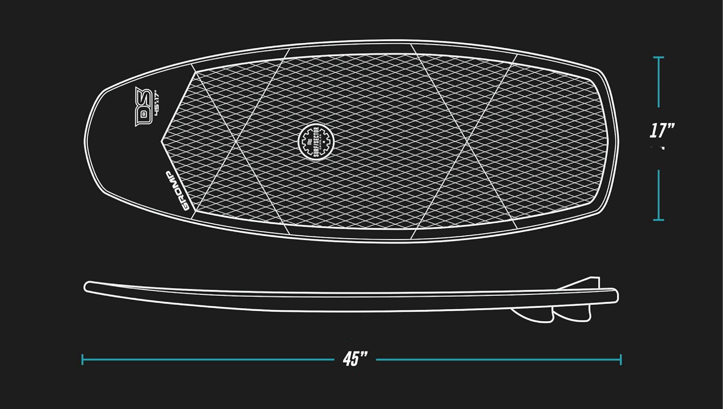
Competitor analysis revealed a market dominated by scaled-down adult boards with minimal consideration for young riders' specific needs. Most children's wake surfboards featured overly complex graphics, adult-oriented branding, or uninspiring designs that failed to capture kids' imagination. Through extensive research into youth-focused sports equipment and successful children's brands, I identified key opportunities: the need for intuitive visual hierarchy, approachable yet performance-credible aesthetics, and a design language that would appeal to both young riders and their parents. This research directly informed The Gromp's bold geometric pattern system, which uses dynamic color blocking to create visual interest while maintaining a clean, professional appearance. The geometric approach also serves a functional purpose—clearly defining foot placement zones and board orientation, making it easier for young surfers to position themselves correctly and build confidence on the water.
What Customers are saying
“Just picked up a Gromp for my 8 year old son and he LOVES IT! He's already brave enough on it to try his tricks. Awesome board, durable, great looking.”
~Dan S.
“This board has been perfect for my 8yo son! Very steady on the water while still allowing for tricks. Good for beginners and intermediate. Would def buy again for kids or young teenagers.”
“My First timer got up easy, the beginner got in the sweet spot and loved it “ way easier than your board dad”. Perfect for my 10,12, and 14 year old.”